Tweets and readable articles
I follow a number of online magazines Twitter accounts. The majority of my Twitter use is done using the iPhone, so the way the publishing of an article is integrated with tweeting the same is important from a mobile client point of view.
There are at least two ways of doing this, one good and one bad.
The good way can be illustrated by looking at how Engadget behaves. First, look at how the tweet looks in the iPhone Twitter client:
I press the link, and I am taken to this nicely formatted and readable article:
However, had I clicked the link on my laptop, this is what it would look like:
You can see that Engadget detects that I am reading the article using a mobile device, and provides the article automatically in a readable format.
The bad way can be illustrated how Computer Sweden behaves. First, the tweet in the iPhone:
I press the link, and I am taken to this horrific experience:
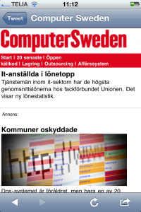
Yes, you can see that Computer Sweden does detect that I am using a mobile device (the link in the upper part of the screen). But instead of directing me to the right article article, formatted nicely, I am presented with a link to the “mobile site”. If I press that link (first I need to zoom it, so I won’t accidentally press the ad), I still have to find the article I was interested in reading:
… then as I find it, you can see that the article does exist in a nicely formatted way:

As you can see, Computer Sweden readers have to take two extra steps to read the article. These two extra steps are most likely a threshold steep enough to keep them from reading the articles from their mobile devices.
My advice to online magazines/blogs is to make sure the user doesn’t have to take any unnecessary steps in reading the articles you tweet. Just make it easy.

